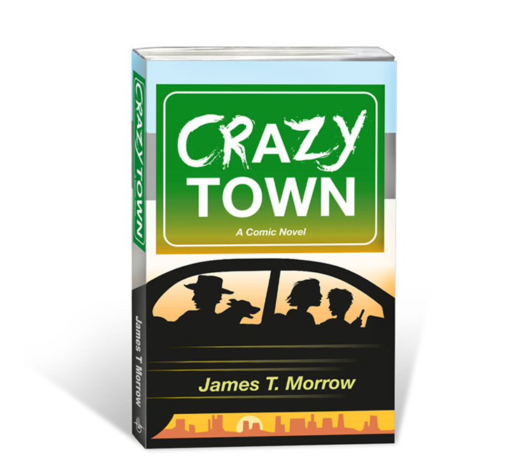
 This is the cover for my new novel CRAZY TOWN.
Originally the novel was titled The Turtle Man, which refers to one of the main characters, an old cowboy who “carries his home on his back and lives life in the slow lane.” But I was afraid people would think it was about turtles (and that didn’t sound very exciting). And, too, he isn’t the main character so I nixed that title. The second title was Chimp, Champ, Chump which I liked a lot for a while. But again I wasn’t sure it reflected the story very well. So eventually I decided on Crazy Town. Weirdly enough, titles can often be one of the hardest parts of writing a book.
During the entire cover design process I kept in mind that most people will see the novel’s cover for the first time as a thumbnail. So I wanted something that would be easy to read at a small size and engaging enough so that people would click on it. I was leaning toward silhouettes early on because they would read easily. Much of the novel takes place on the road as various people try to chase down a young woman and her son. The woman and boy are helped in their escape by an old cowboy and his dog so I settled on those four characters.
Originally I had the four of them running as you can see in the left image below. You can see the lettering was different too. Early on I decided that since much of the novel takes place on the road, that using a freeway sign for the title might work. Strangely enough I didn’t originally set the font in Helvetica (which is what highway signs use). Instead I wrote it as if it were graffiti, scrawled by some mischievous prankster. That added to the “crazy” feeling of the book but it didn’t work when the entire sign was written that way. Still I felt I was headed in the right direction. As you can see in the second version I reworked the lettering combining the font of real freeway signs with the hand painted look of graffiti. I also added color to the background. (There were many more versions in between those I’m showing but, to keep it simple, I settled on these three). Soon I decided to place them inside the car, since that more accurately reflected the book and because at this point it just looks like a family out for a jog. Once I added the car, I turned the cowboy and boy to have them looking back apprehensively, while the anxious woman and the dog lean forward.
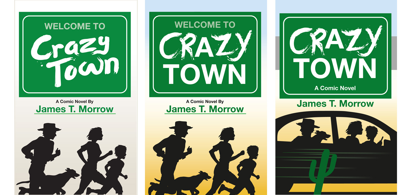
To establish that much of the novel takes place in the American West, I added a cactus. But it didn’t read very well, looking a bit too cartoony and it blurs with the speedlines on the car so that it’s confusing to the eye: is the car going fast or is it the cactus? Finally I kicked out the cactus and added a series of distant plateaus instead. This worked much better, especially after I added a setting sun. The sunset, explained the silhouette nature of the illustration even better, plus it adds a reddish hue to the image, which subconsciously suggest danger. Plus the setting sun carries the connotation of “running out of time” which adds to the anxiousness of the illustration. And, finally, I gave the sign a rusty tinge at the bottom edge so that it would blend in better with the illustration in the lower half.
The cover was created in Illustrator, then brought into Photoshop for some tweaks.
The novel can be purchased at Amazon (either as a Kindle download or as a paperback) by clicking HERE.
Below is a promo video for the novel. (By the way, let me know if you’d like to see a blog about how I went about creating the video.)