 My new novel, BLUE JASMINE, is now available on Amazon.com.
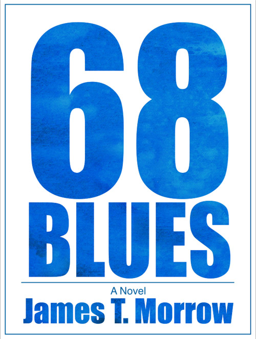 I thought you might enjoy seeing how I came up with the cover. Of course, much of the design depended on the title and for a long time I really didn’t have one I liked. For several years while I worked on the novel it went by the working title of 68 BLUES. But I never really liked that.
The novel occurs in 1968 and centers on a young college student (J.J. Parker) who is majoring in art. He’s interested in painting portraits and soon falls in love with a young black woman (Jasmine Andrews) who loves blues music. There’s a lot more to the story of course; it’s a murder mystery and a coming of age story as well as a story of a forbidden romance. ButI felt combining those two elements (art and blues) could lead to a good title and an inviting cover.
At one point I came up with A THOUSAND SHADES OF BLUE, which I liked, but a few months later Fifty Shades of Gray hit the stores and I thought people might think I was ripping off its title so I nixed that idea. I tried PAINT THE HEART BLUE, THE PAINTED HEART, THE BLUE HEART…well, you get the idea.
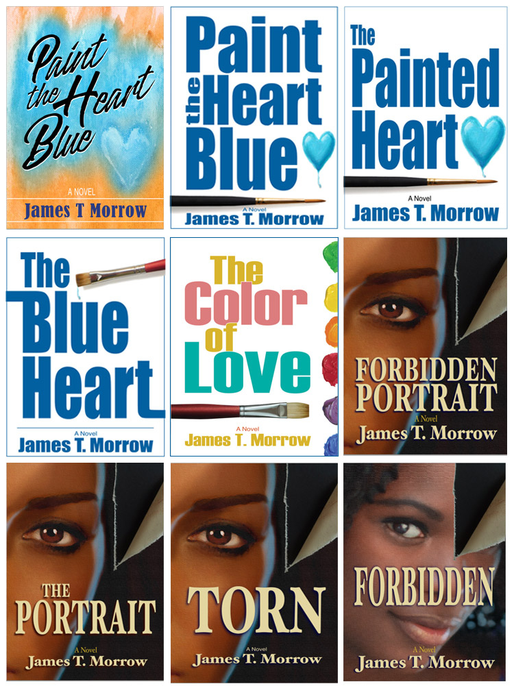 I also tried TORN PORTRAIT, FORBIDDEN PORTRAIT, etc. I came up with dozens and dozens of titles and I even ran most of them through a website called Lulu.com which compares your potential title with those from 50 years worth of bestsellers.
Since the woman the young artist falls in love with is named Jasmine I naturally came up with the title BLUE JASMINE. (There’s a Woody Allen movie by that title but I wasn’t aware of that until after I’d copyrighted the book.) The wife of a friend suggested DARK BLUE JASMINE since it’s a “dark” story and for a while I considered it. I ran the title through Lulu.com but it didn’t do any better or worse than just BLUE JASMINE. I next surveyed friends and family to see which they liked best. The two titles ran neck and neck for a while, then BLUE JASMINE finally won out.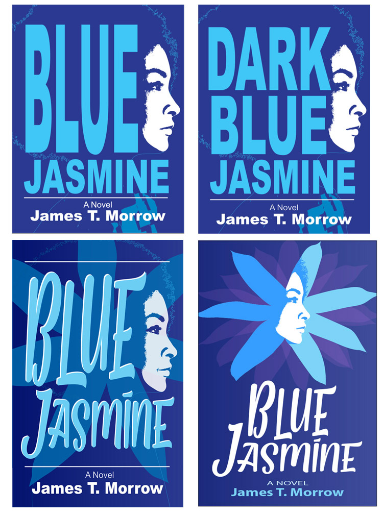
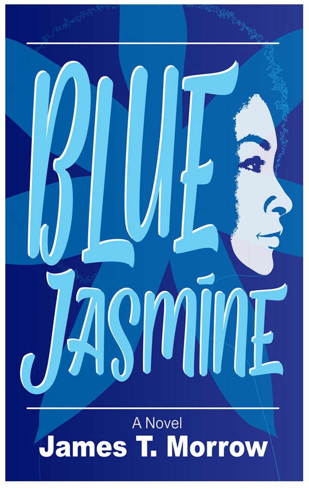
Even once I had the title, I was still a long ways from getting a cover I liked. I did multiple sketches but finally decided on a simple profile of Jasmine, highlighted against a dark blue background. One thing I soon decided was that the bold san-serif font (Arial Black) I was using didn’t reflect the story all that well and was a little off-putting. I needed something more inviting, more causal, and after playing with several options I, at last, switched to a font called Pathout. I squeezed it and added a few embellishments to make it work to my liking.
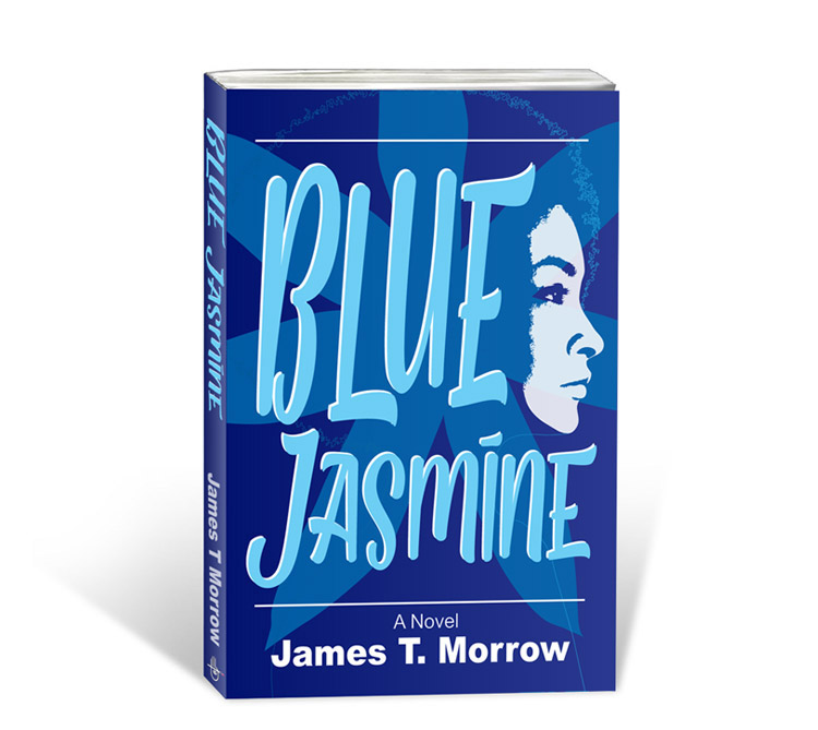
At one point I considered placing the girl’s profile inside a cutout of a jasmine flower. I liked it but finally I went back to the large profile as you see in the final art. The main reason is that these days most people view the cover online as a thumbnail. I thought the one with the larger profile and larger title would work better for that reason. Plus most friends I showed the two options to, preferred the larger profile.
It was a long road and the cover went through a lot of twists and turns but I finally arrived at something that I think reflects the novel well.
(Click on the final art shown below for a larger view.)
CLICK HERE to view a promo video for the novel.
CLICK HERE to purchase the novel.